Malevich

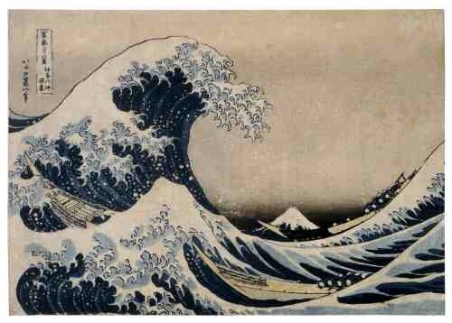
I knew he was deep, and suspected he was dark – but another find in the library shows he painted like a man possessed through some extraordinary times. Kazemir Malevich (1878-1935) the great Russian artist went from here:

20140614-215739-79059734.jpg

To here:

20140614-215813-79093001.jpg

Via here:

20140614-215837-79117724.jpg

And here:

20140614-222316-80596901.jpg

Before changing art forever here:

20140614-220200-79320546.jpg

And ending persecuted but proud here:

20140614-220304-79384400.jpg

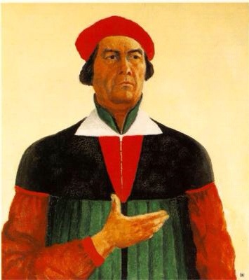
From impressionism, through cubism, to futurism and his own creation ‘suprematism’. Malevich created the ultimate abstraction in the ‘black square’, but ended his years under Stalin only being able to hint with a coy hand gesture at the ideas he created – that true art takes nothing whatsoever from nature and is pure ‘form’.

Modern art gets a mixed reception. But I’m staggered at what Malevich produced in a single lifetime. He is a dozen artists in one – and lived a life which spans, encapsulates and created a true revolution.

Waves

20140531-215435-78875213.jpg

I waved goodbye to ‘Japanese Prints‘ at the library today. Here it sits among the ‘recently returned’ next to someone else’s thriller and two DIY oil painting books.

Japanese wood block prints, I learnt, were the product of art, craft, populism, censorship and Japan’s desire for isolation from the rest of the world.

Hokusai’s ‘Great Wave’ is perhaps the most famous of all Japanese wood prints and belongs to the groundbreaking series ‘Thirty-six views of Mount Fuji’. Most Japanese prints were of famous actors, warriors or courtesans. Landscapes were few and far between, until this series.

20140531-215723-79043940.jpg
But what is also unusual about this print, is it draws on the industrial prowess of 19th century Germany. It was the first Japanese series to exploit the new chemical ‘Berlin blue’ pigment (also known as Prussian blue) which had recently become available from China. It gave Hokusai a strong but fine blue for both sky and water unlike the sticky splodgy ‘Indigo blue’ and did not fade like the other more watery traditional blue pigments.

On the other side of the world, German chemists enabled Japanese artists and printers to create many thousands of fine prints. These then found their way back to France and inspired Monet, Manet and the Impressionists, as well as the ‘new wave’ Art Nouveau posters of Toulouse Lautrec, which adorned and still define Paris.

It’s a small world. Japanese wood blocks sat next to oil paintings in 19th century Paris too.

20140601-075747-28667351.jpg

Art Mimics Life

My lovely girl has got ‘in line’ skates for her Birthday. And very pleased with them she is too. At the same time – in the interests of developing my own interests – I decided to dust off and twang my old ukulele and pick a picture to contemplate from my unopened Christmas art book.

And here it is: ‘Unique Forms of Continuity in Space’, a bronze Futurist sculpture from 1931 by Umberto Boccioni.

20130601-150324.jpg

Described as ‘an expression of movement and fluidity’, it has a bit more oomph than my wobbling ‘little Miss’. But the coincidence of art mimicking life tickled me.

Boccioni’s sculpture is depicted on the the Italian 20 cent euro coin. And after a tentative start she’s on the money too, trying hard – and getting there with her snazzy new skates.

In the Balance

20120520-185041.jpg

Why is it we feel a little cheated by art made of everyday objects? Is it because we value the materials as well as the labour?

Talking to a Sri Lankan clothing entrepreneur this week, I discovered that in modern garments a surprisingly large part of their price is in the materials – 65% or more. This may tell us that labour is undervalued. But it might also tell us that materials still matter.

Historically pigments were immensely expensive. Some say the reason medieval art had large patches of colour – undisturbed by shading or relief – was to ‘show off’ the expense and opulence of the rare pigments; usually topped off with plenty of gold leaf.

By contrast, Damien Hirst’s dot paintings are always sneered at for ‘only’ using household emulsion. But then again his diamond encrusted sculls divide opinion too.

I’m strangely reassured to know my clothes are made of stuff of intrinsic value. Perhaps, like the ‘rag trade’, it takes the right balance of labour and materials to make a great work of Art too.

Flights of Fancy

20120519-121313.jpg

I found myself in a back room at the British Museum this week, looking at pen and ink drawings. I took a couple of photos of simple but stunning sketches by Picasso and Rembrandt.

20120519-123215.jpgAs a child, I remember being taken to see Michelangelo’s cartoons and being mightily disappointed they weren’t a patch on Hanna-Barbera. They were instead faded brown pastels. How times change.

Why the reappraisal – I’m much taken by Ernst Gombrich’s narrative that art of the Dark Ages was flat and naive because it was telling you something. The idea wasn’t to lose yourself in clouds, folds of garments or acres of flesh – but to ‘read’ a very simple and profound message. Almost always an illustration of virtue, sin or gospel truth, simplicity and directness were the point.

This takes me back to Aristotle’s Poetics – plot trumps spectacle and no more or less than is needed. Were I to embark on a painting I’d feel constrained to ‘represent’, to paint ‘well’ and show some technique.

Perhaps that’s not the point, the starting point for the artist is: ‘what am I wanting to say or explore?’ As with poetry, seen this way we are not ‘trapped’ by the fact that everything has been painted more beautifully by Titian, or precisely by the Dutch masters or bleakly by Caspar David Friedrich or vibrantly by Van Gogh.

20120519-090306.jpgThe job of the artist is simply to convey what they want to say or explore. Technique and materials come second. No need therefore to hack off our beautiful – or rudimentary – artistic wings. We can all have a go.